


Timeline: June - August 2018
Project Type: Desktop Application
Role: Interaction Design Intern
Tools: Sketch, InVision Craft
Skills: Heuristic Analysis, User Testing, Thematic Coding, Accessibility, UX Patterns, Wireframing
Project Type: Desktop Application
Role: Interaction Design Intern
Tools: Sketch, InVision Craft
Skills: Heuristic Analysis, User Testing, Thematic Coding, Accessibility, UX Patterns, Wireframing
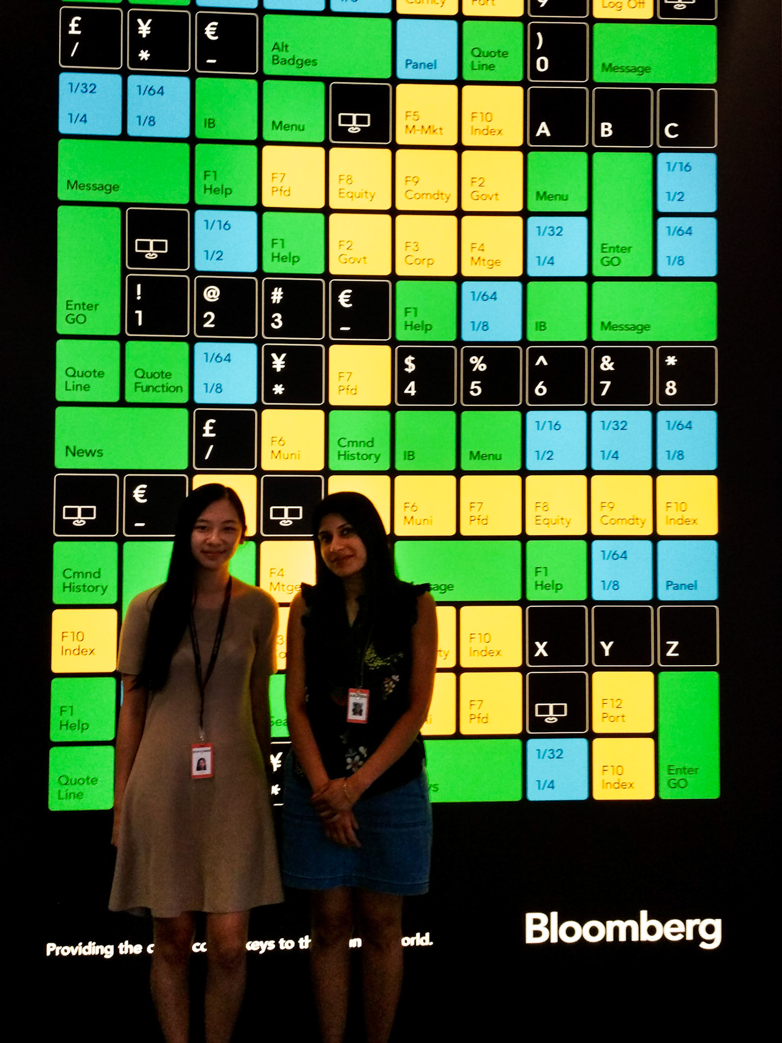
A photo with my mentor on my last day, in front of Bloomberg's coloured keys to the financial world.
Context
Sitting on the desks of 325,000 of the world’s most influential decision makers, the Bloomberg Terminal has been a modern icon of financial markets since 1981. Long before PCs and the internet became ubiquitous, the Bloomberg Terminal brought transparency to financial markets. It connected market participants to a groundbreaking data, analytics and information-delivery service — and revolutionized an industry.

Learning to Navigate the Terminal
Before I could begin to design for the Terminal, I had to understand it first. As someone who has no financial background whatsoever, it was a challenge to understand the user goals of financial professionals. My first weeks were spent attending as many team critiques as I could, setting up 1 on 1's, and laying out a framework for my internship.
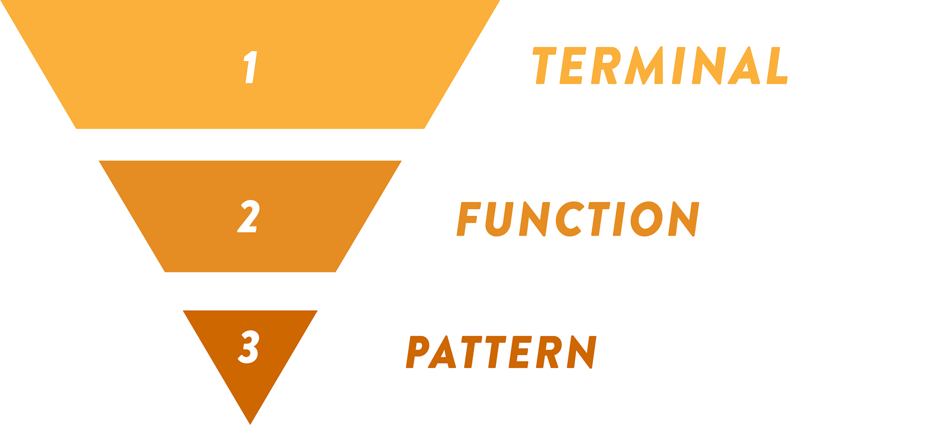
I decided to tackle the Terminal one level at a time. First, I'd get a broad understanding of how the system works as a whole. Next, I'd dive into a specific function to learn how its design elements function together. After, I would look at why a particular design element works the way it does. A wrap up project would be the culmination of all the insights I'd acquired from previous projects.


Over the course of my internship, I delved into four projects, exploring accessibility, heuristics, pattern libraries, and user testing. Consulting multiple teams in the UX department including their Research and Consistency teams, I was able to have a constant source of feedback as well as an audience for the work that I was doing.

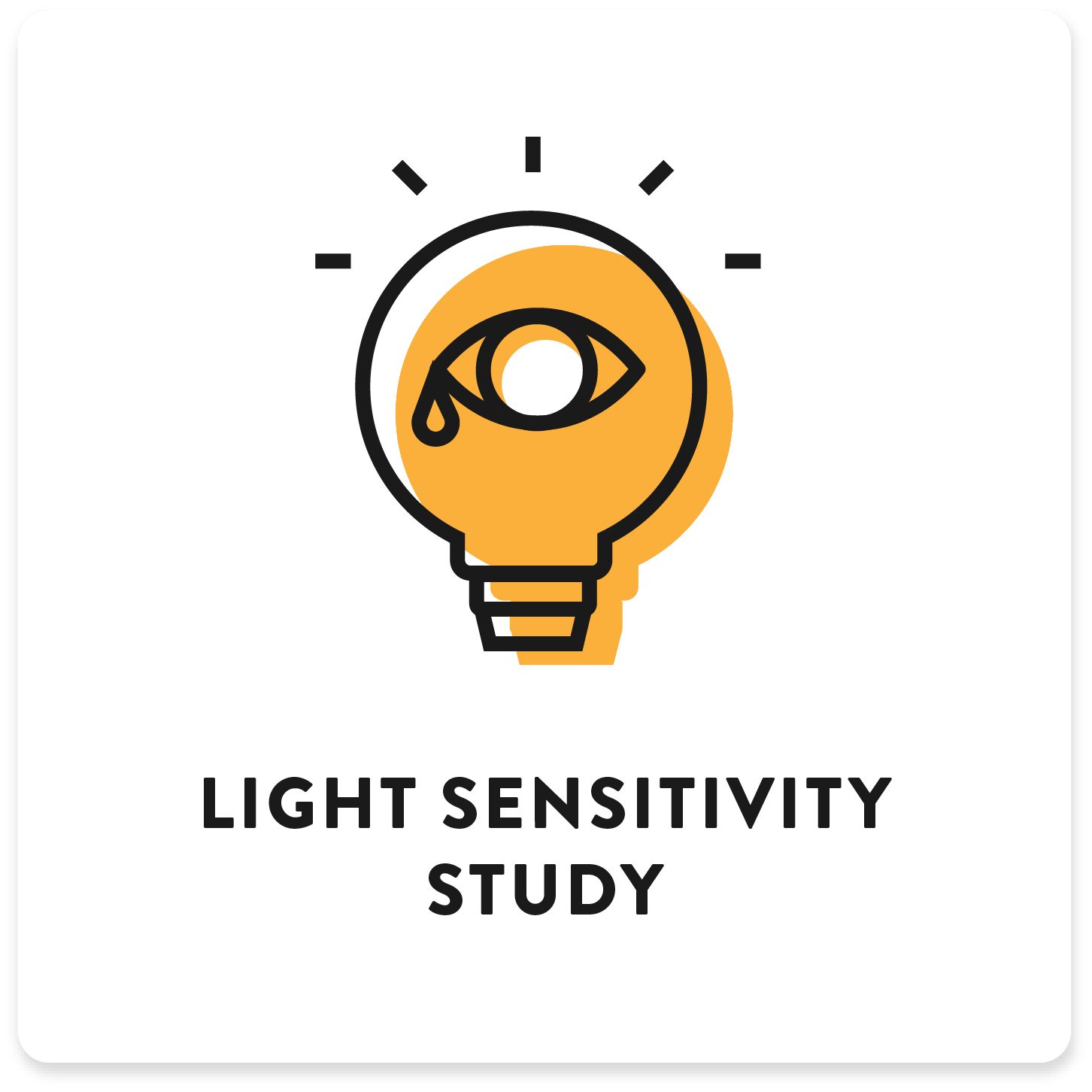
1. Light Sensitivity Study
After developing light-sensitivity, Robyn, an 8 year Bloomberg employee almost had to resign from her job. This was because of her chronic migraine condition, whose symptoms trigger when looking at bright screens, high-saturation colours, and erratic movement.


Robyn voiced her concerns about the Terminal with the leader of the B-ABLE community, which is Bloomberg's employee group that advocates for people with disabilities. I volunteered to take on the project to consolidate the insights she gave us in an interview to better understand the current state of accessibility at Bloomberg.
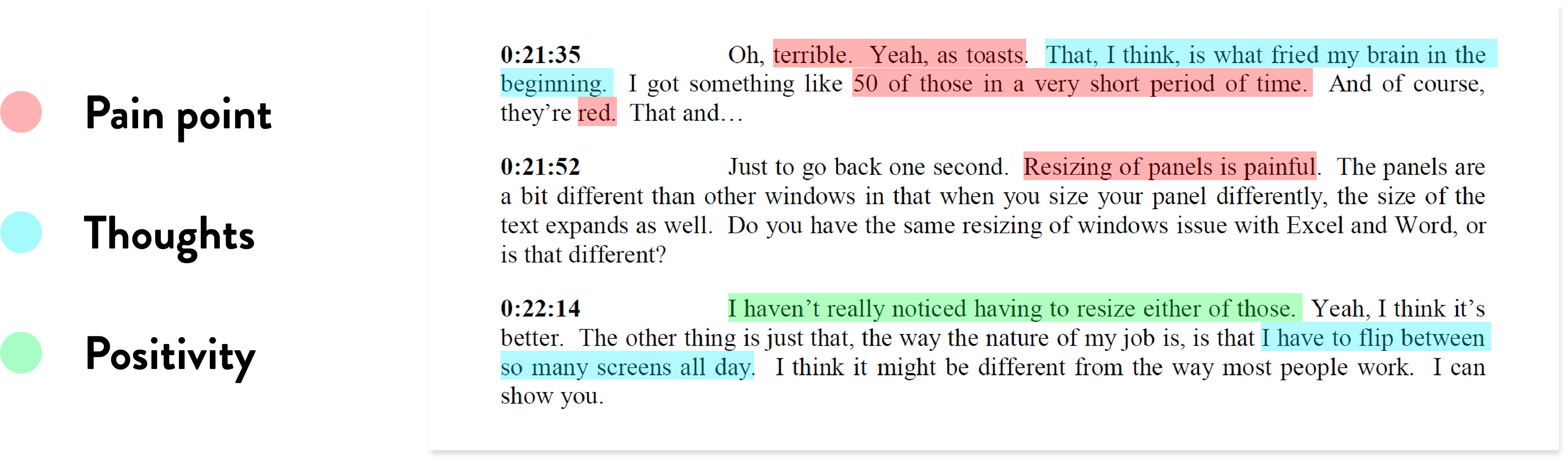
My methodology in approaching this project started with thematic coding, a form of qualitative analysis that identifies passages linked by common themes. By highlighting key findings in the transcript, I was able to create a framework of thematic ideas that I could then tackle according to Nielson Normon Group's severity index.
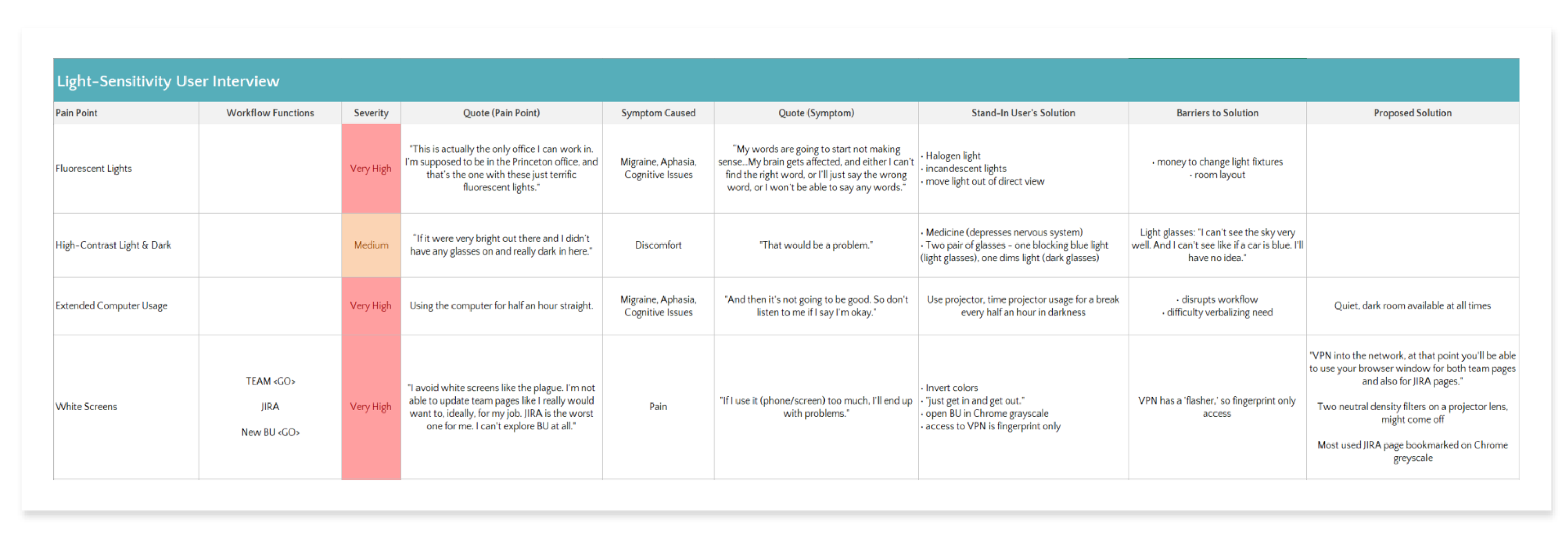
Next, I conducted secondary research regarding the medical side of light-sensitivity, diagramming key points and creating a list of design guidelines. The current state of accessibility at Bloomberg is reactive - disabled people have to voice their concerns before anything is done. I pushed for Bloomberg to be more anticipatory of their needs, drafting a list of design guidelines that the visual team can keep in mind for the future.
Below is an example of some design guidelines:
"Avoid red, white, and high saturation colors.
Avoid flashing animations - 2 to 8 cycles/second cause the most discomfort.
Avoid blue or red wavelength light.
Do not use row-striping."
Avoid flashing animations - 2 to 8 cycles/second cause the most discomfort.
Avoid blue or red wavelength light.
Do not use row-striping."
The final deliverable was a presentation shown to Bloomberg employees, with visual design leads in attendance, among other senior designers.

2. BIO Heuristic Evaluation
Heuristic evaluation is a usability engineering method for finding the usability problems in an user interface design. By comparing Nielson Norman Group's 10 Usability Heuristics to BIO, I dove into one function to understand the Terminal on a deeper level.
Though a heuristic evaluation usually does not include the positives of a user interface, I included them to show the product owner that my evaluation was unbiased towards finding negatives. By meeting the product owner and designers of BIO, I got to hear why certain design decisions were made, in spite of the fact that I had deemed many as errors.
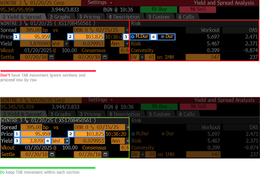
3. UX Forms Pattern
The Bloomberg Terminal has been in the market since 1982. This leaves many functions that are inconsistent and do not follow best practices. An extensive design system, called UX<GO>, was made to address these inconsistencies by establishing a standard for Bloomberg functions. A UX checklist was also created, where each new or updated function must pass certain requirements before launch.
Working with Bloomberg's UX Consistency team, I drafted a new pattern for UX<GO> surrounding form design. By conducting research on web forms, I adapted web best practices to fit within the Terminal's limitations.
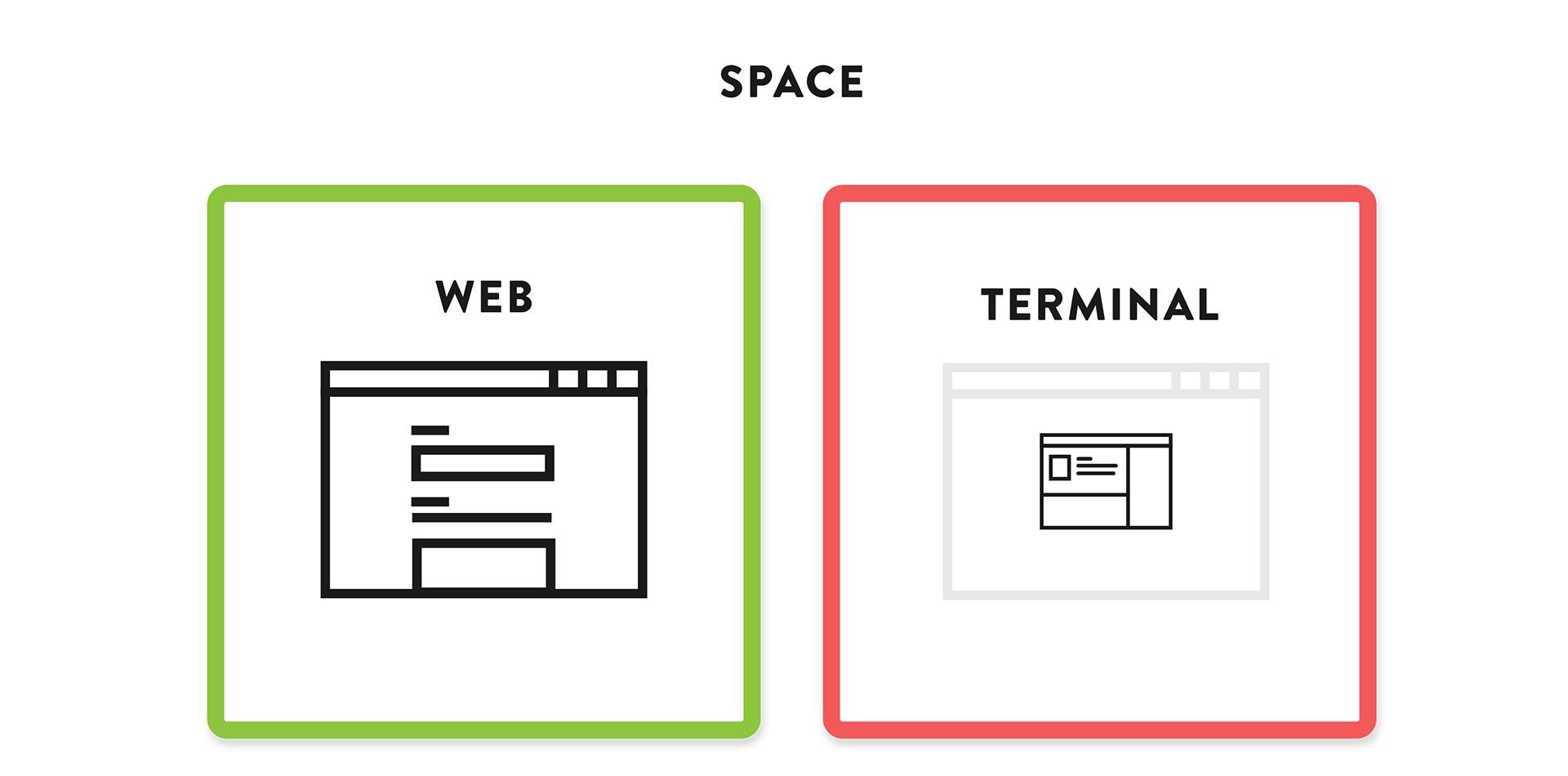
On the web, people view often view forms with their browser in fullscreen. The typical user of the Terminal uses duel monitors, with a 4-panels layout on each, limiting available space.
Aside from defining what a form is and when it should be used, I created visual guidelines using the existing Bloomberg design systems as examples of best practices.
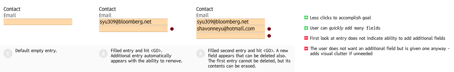
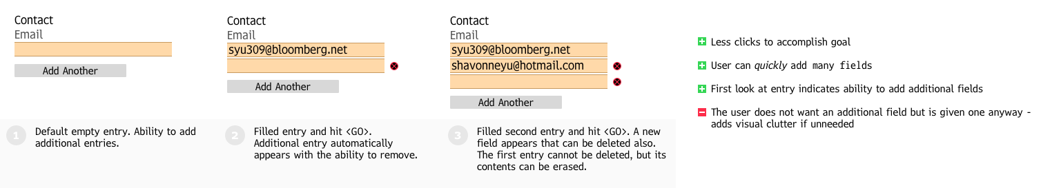
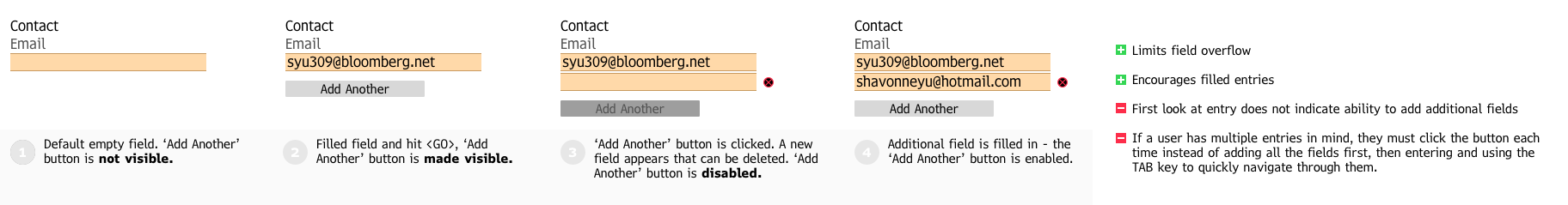
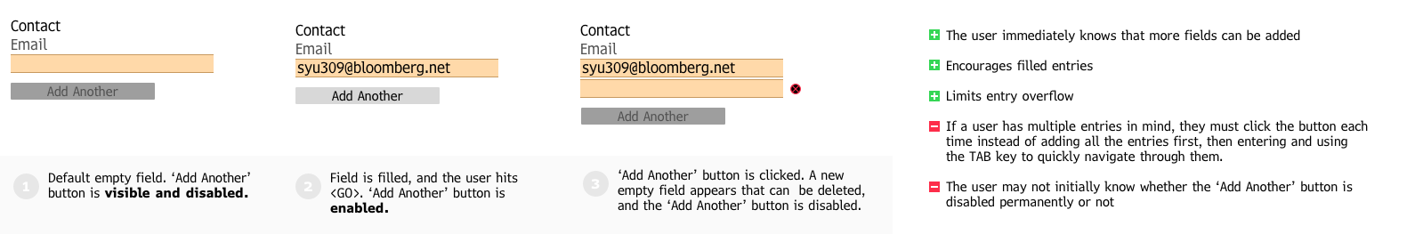
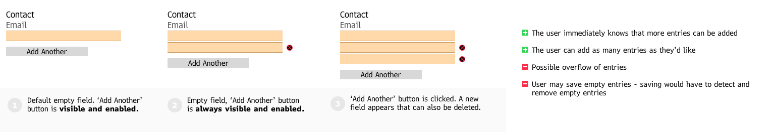
I delved into behaviour for adding additional entries, with permutations including disabled buttons, auto adding fields, and the ability to delete empty fields. After consulting other designers, we opted for behaviour that allows the largest amount of user freedom.
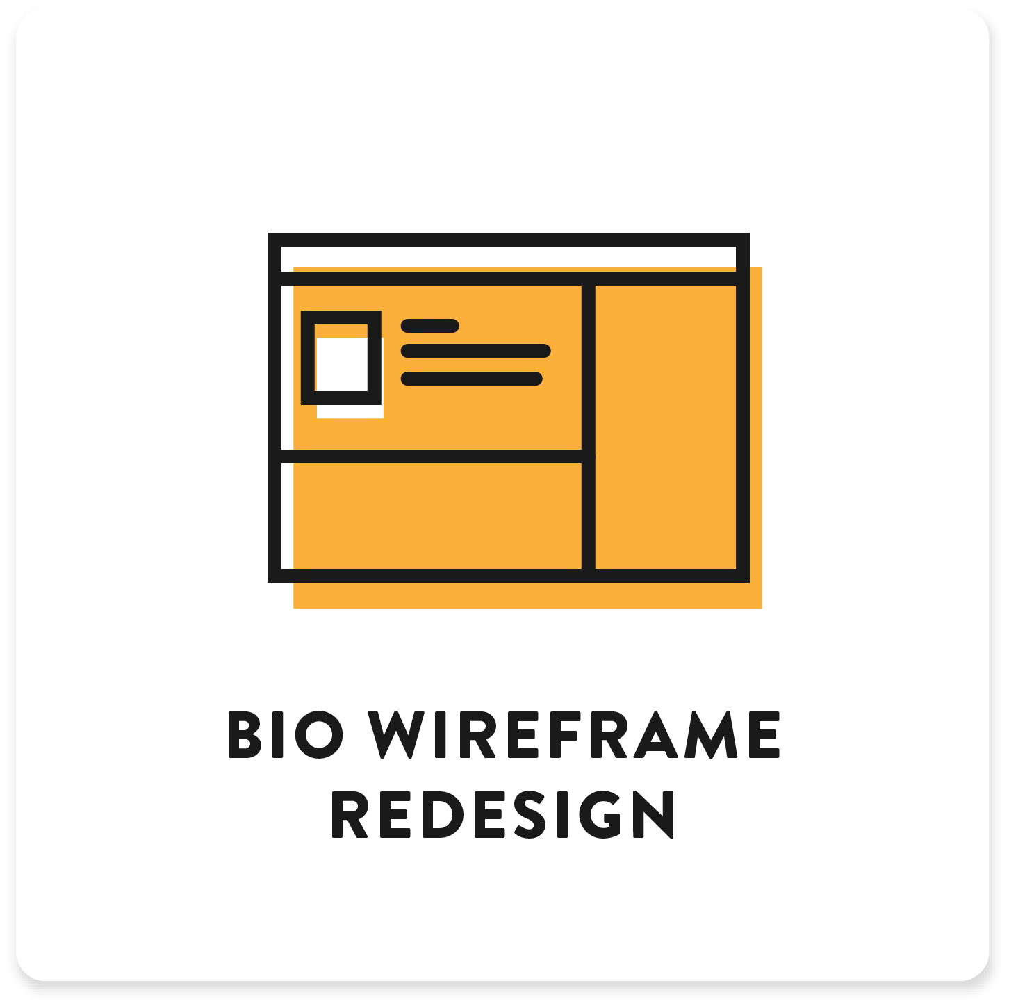
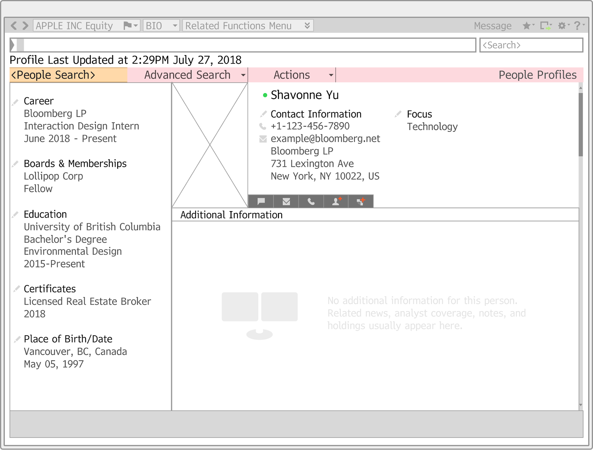
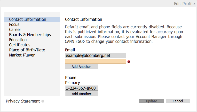
4. BIO Wireframe Redesign
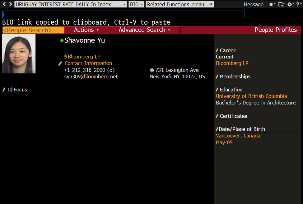
As one of the top most used functions on the Terminal, the BIO function stood out as one of its core components. Terminal users can look up any other Terminal user's contact information, news about them, and more.
Because this function utilizes forms, I was able to apply my findings about best practices for form design. Addressing a function that wasn’t related to finance meant my solutions for forms could be applied more generally across all functions.

After creating the wireframes, I had one week left of my internship. Although I was strapped for time, I pushed for conducting user tests in Bloomberg's state of the art usability lab (they had one-way mirrors!)
Working with the UX Research team, I wrote a script to follow when testing users on BIO. In it, I outlined certain tasks to see if the user could complete them successfully, as well as documenting pain points. Through user testing, I was able to confirm or disprove my assumptions I'd made through my heuristic analysis.
After the testing, I reviewed the recordings and compiled them into a spreadsheet that shows whether they were able to complete the task, as well as key quotes from the participants.
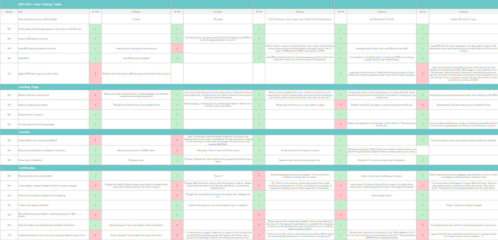
By comparing my findings from the heuristic evaluation I conducted to the findings from the user studies, I was able to validate or disprove the usability problems that I initially discovered, and apply these insights to my redesign.